Ember Restaurant Website Design
The Problem: Busy workers and commuters lack the time necessary to prepare a quality family meal.
The Goal: Design a responsive website for Ember Restaurant that allows users to easily customize and order quality meals.
Project overview
My role: UX designer designing an website for Ember BBQ Restaurant from conception to delivery using Adobe XD.
Responsibilities: Conducting interviews, paper and digital wireframing, low and high-fidelity prototyping, conducting usability studies, accounting for accessibility, and iterating on designs.
Research
I conducted interviews and created empathy maps to understand the users I’m designing for and their needs. A primary user group identified through research was busy adults who don’t have time to cook meals.
This user group confirmed initial assumptions about Ember’s customers, but research also revealed that time was not the only factor limiting users from cooking at home. Other user problems included customization frustrations and menu inconsistencies that made it difficult for users to order from the restaurants website.
User research:
pain points
User journey map
Persona
Start the Designing
Sitemap
Lack of ease and customizability were a few primary pain points from the users, so I utilized that knowledge to create a sitemap.
My goal here was to make strategic information architecture decisions that would improve overall website navigation. The structure I chose was designed to make things simple and easy
Paper wireframes
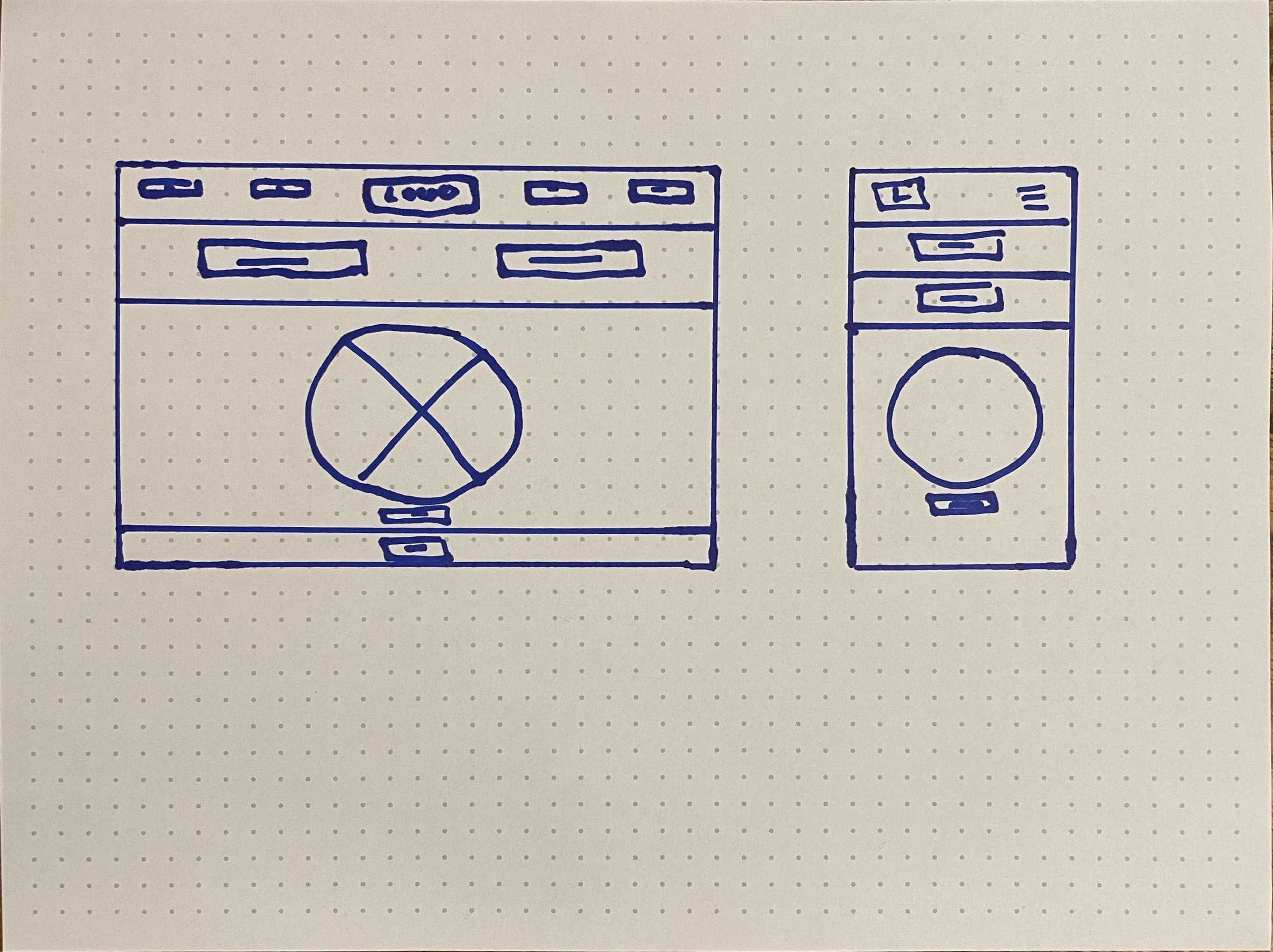
Next, I sketched out paper wireframes for the website screen, keeping the user pain points about customization and up to date menus in mind.
The homescreen paper wireframe variations to the right focus on easy and quick user flow.
Paper wireframes screen size variation
Because Ember BBQ Restaurant customers have access to the site on a variety of different devices, I started to work on designs for additional screen sizes to make sure the site would be fully responsive.
Digital wireframes
Moving from paper to digital wireframes made it easy to understand how the redesign could help address user pain points and improve the user experience.
Prioritizing useful button locations and visual element placement on the homepage was a key part of my strategy.
Digital wireframe screen size variations
Low-Fidelity Prototype
To create a low-fidelity prototype, I connected all of the screens involved in the primary user flow of adding an item to the cart and checking out.
At this point, I had received feedback on my design from users about things like placement of buttons and page organization. I made sure to listen to their feedback, and I implemented several suggestions in places that addressed user pain points.
Usability Study: Digital wireframes
Study Type: Unmoderated Usability Study
Location: United States, Remote
Participant: 5 Participants
Length: 10 minutes
Usability study: findings
Tracker: At the end of the checkout process, the user did not completely understand the tracker.
Menu: Users were a bit confused about clicking the order button first as opposed to a menu button in the homescreen
Refining the design
Mockups
To make the ordering flow even easier and clearer for users, I changed the main call to action button on the homescreen from “Order” to “Menu.”
Based on the insights from the usability study, I made changes to improve the site’s tracker. The change I made was adding color and words to the center of the tracker bar. This allowed users to better understand what the changes in color meant and where they were in the post ordering process.
Mockups original screen size
Mockups: Screen size variations
I included consideration for additional screen sizes in my mockups based on my earlier wireframes. Because users shop from a variety of devices, I felt it was important to optimize the browsing experience for a range of device sizes, such as mobile so users have the smoothest experience.
High-fidelity prototype
My high fidelity prototype followed the same user flow as the low-fidelity prototype, and included the design changes made after the usability study, as well as several changes made after the usability study, as well as several changes suggested by members of my team.
View my Ember BBQ Restaurants: High-fidelity prototype
Accessibility considerations
Impact
One quote from peer feedback:
“It was pretty self explanatory! I loved the pictures, I loved colors behind it, the food looks really enticing, and so does the website itself overall, I think it was really good! There wasn’t anything that I necessarily disliked. It was quick and easy so that’s always a plus.”
Let’s connect!
Thank you for your time reviewing my work on the Ember BBQ Restaurant website! If you’d like to see more or get in touch, my contact information is provided below.
Email: omassaquoi14@gmail.com
Website: oliveux.com


